Tech topic.
Display inline vs inline-block.
I've chosen this particular topic as it's the option that I most need to brush up on.
An analogy to begin.. hmmmmm.
Perhaps think of seats in a movie theatre. These are inline elements. It’s best not to kick your legs out and annoy the row in front. You can buy the seats to your left and right if you want to some space either side, but you can’t push the row in front out further. An inline-block example might be setting up campsites in rows. One group might decide to expand their block all around and luckily there’s plenty of space for all the neighbours to move a bit. If these campsites were inline elements the neighbours would refuse to move, so would just get cross about their space being taken, resulting in a bad camping experience for all.
An inline element is designed to nestle nicely inline, amongst other elements without disrupting the space and placement of surrounding content. An example of a common inline element is a link < a > within a paragraph. This nestles in neatly has styling limitations to prevent vertical margin, padding and size adjustment causing problems for lines above and below.
An inline-block element on the other hand will sit inline with other content but is free to accept all size, margin and padding adjustment, so will fit a different purpose. A regular block element – h1 or div for example – by default consumes 100% of the width of the parent element that it sits within, regardless of its size. If the inline-block property were applied to said h1 or div, they would be able to sit side-by-side while retaining their ability to be sized independently.
A common example where inline-block is used is navigation buttons placed side-by-side. Inline-block will let these sit next to one-another while allowing style properties to size and space them as needed.
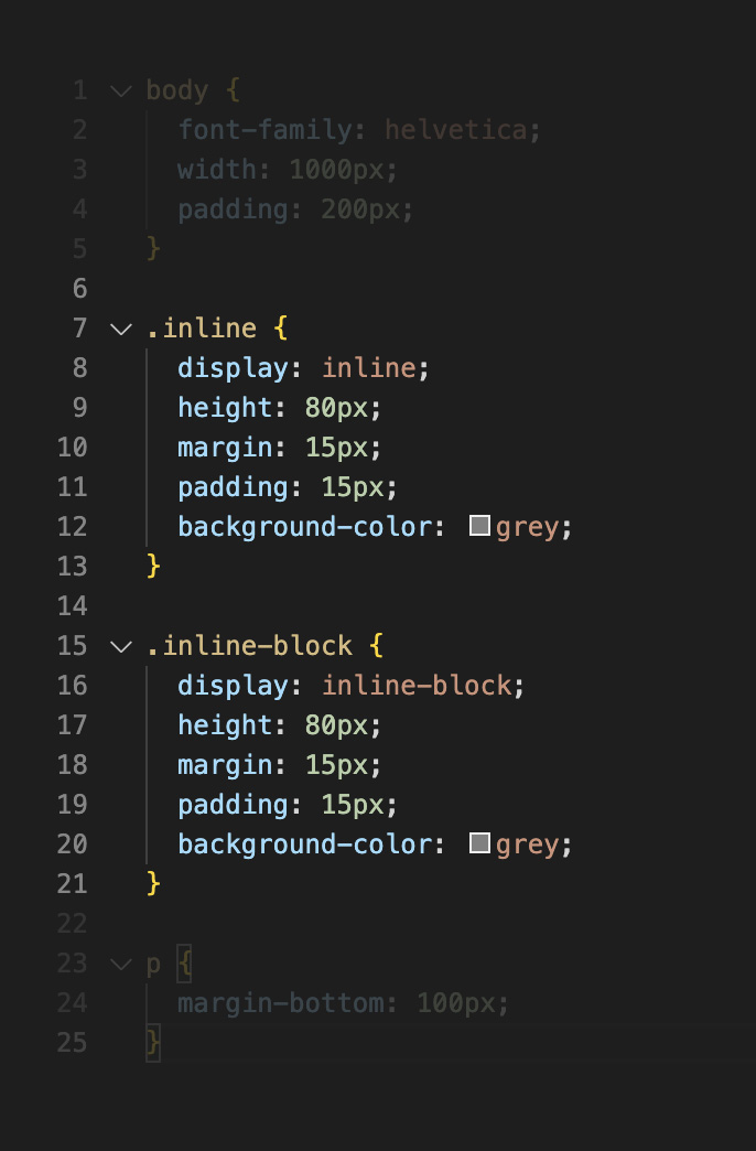
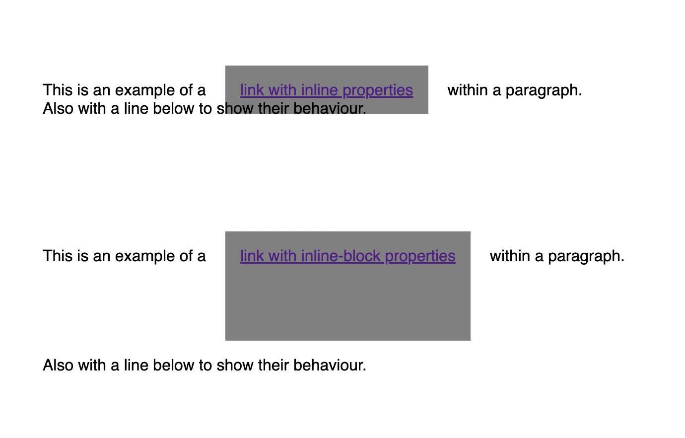
The example below is a quick and crude mock-up to show how the both act differently with surrounding content. Both have exactly the same size styling applied, though the inline-block will push out its neighbours. Note that the padding top and bottom of the inline example has blown out the grey square but not moved anything, while the height property has been ignored.


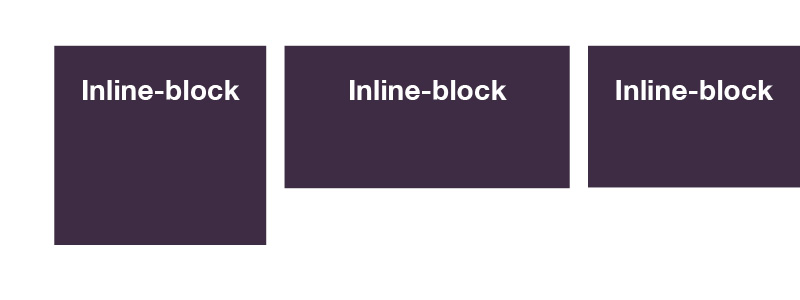
Height adjustments to inline elements (below-left) wont do much, whereas the same adjustments to inline-block elements (below-right) will.

